A good offer alone is not enough to guarantee success. You also need to communicate that offer to your target audience. Typically in the form of a landing page.
If you’ve ever stared at a blank page trying to sort out the thousands of design and copy options for your landing page, you’re not alone.
But you don’t need to start from scratch. You can base your landing page on proven landing page examples.
That’s where this post comes in.
Hundreds of landing page examples scored
We combed through hundreds of landing pages in order to find the best across many categories. And since I know you care most about the landing pages relevant to your use case or industry, you can use the filters just below to only see the examples that are likely to provide you with inspiration.
Finally, there’s a score out of 100 for each landing page. You can click each score for a more detailed breakdown. Note that this is far from a robust score, and is subjective, but it should give you a quick indication if there’s any obvious room for improvement for each page.
YOPA
| Clarity of what is being offered: | 30 |
| Offer addresses pain points: | 10 |
| Clear and consistent call to action: | 20 |
| Good contrast in colour scheme: | 10 |
| Balanced and clear layout: | 10 |
| Draws attention to main CTA: | 15 |
Categories: Services, Long, Unique
Strong benefit-driven headline – Within 5 seconds of landing on this page, you know that YOPA has agents to help you sell your home, and do it for a fixed fee. Cost is a big concern for most home sellers initially, so this headline will attract most visitors’ attention.
An interactive way to reinforce benefits – Slightly down on the page is a simple sliding calculator:
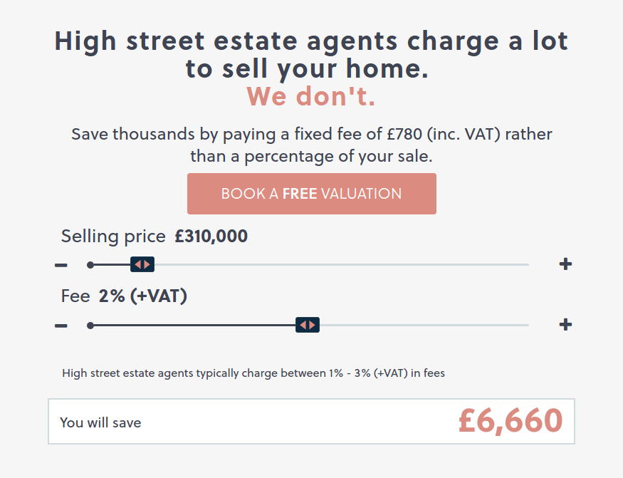
As the visitor slides the selling price of the home, they see their savings increase. If someone was drawn in by the proposed savings in the headline, this helps to make it more tangible.
Consistent CTAs – If you view the landing page on a desktop, there’s almost always a single, clear Call to Action button on the page.
RBC Life Insurance
| Clarity of what is being offered: | 30 |
| Offer addresses pain points: | 10 |
| Clear and consistent call to action: | 20 |
| Good contrast in colour scheme: | 15 |
| Balanced and clear layout: | 8 |
| Draws attention to main CTA: | 5 |
Categories: Services, Short, Minimal
If most visitors only care about 1 thing, give it to them – This is a short landing page. I highly suspect that’s because life insurance is mostly something people buy because they have to. They care about 2 things: how much it will cost them, and how much they’d get out of it.

After a brief list of benefits, the page concludes with the above form. It doesn’t have too many form fields, and gets the visitor a quick quote, which is exactly what they want. I believe this page would perform even better if the form was pushed above the fold.
Direct Line
| Clarity of what is being offered: | 25 |
| Offer addresses pain points: | 10 |
| Clear and consistent call to action: | 15 |
| Good contrast in colour scheme: | 15 |
| Balanced and clear layout: | 8 |
| Draws attention to main CTA: | 10 |
Categories: Services, Long
Visitors can take their desired action immediately – Someone looking for car insurance wants a quote, and not much else. This landing page makes a quote request simple, and puts it right at the top with few distractions.
There are some people who want more specific details before getting a quote, but they expect to do some digging, so scrolling is an expected effort on their part. This landing page is rather long, and includes coverage details, reviews, and more.
Purple Bricks
| Clarity of what is being offered: | 30 |
| Offer addresses pain points: | 10 |
| Clear and consistent call to action: | 20 |
| Good contrast in colour scheme: | 15 |
| Balanced and clear layout: | 10 |
| Draws attention to main CTA: | 12 |
Categories: Services, Long
Do your customers need to trust you – Purple bricks is a property management company who takes care of your rental properties. If you’re potentially going to hand your keys over to someone and give them full access to a home of yours, you must trust them.
This landing page focuses on trust first. It starts with multiple trust elements above the fold:
- Picture of actual employees (who seem reasonably trustworthy)
- A 5 star TrustPilot rating symbol
- A badge for the Association of Residential Letting Agents
Lower down on the page are more reviews.
A reserved CTA that stands out – Take a look at the full landing page if you have not. Orange stands out clearly on the white and purple background. Orange is only used for the preferred CTA of getting a valuation. There are other CTAs, but they’ve been designed to not stand out as much so that they don’t distract from the primary CTA.
SuperCarers
| Clarity of what is being offered: | 30 |
| Offer addresses pain points: | 10 |
| Clear and consistent call to action: | 20 |
| Good contrast in colour scheme: | 15 |
| Balanced and clear layout: | 10 |
| Draws attention to main CTA: | 10 |
Categories: Services, Video, Simple
A clear message and design – It’s a simple landing page, which makes it very easy to read. It’s easy to see what the business does from the first headline. The actual CTA (button) above the fold could stand out much more if it was changed to orange.
Further down the page is a video:

It’s a short video where clients share their positive experience with the service. Since this is a life-changing service (in either a positive or negative way), it’s good to provide clear examples of positive results.
Smartdata Medical
| Clarity of what is being offered: | 20 |
| Offer addresses pain points: | 10 |
| Clear and consistent call to action: | 5 |
| Good contrast in colour scheme: | 15 |
| Balanced and clear layout: | 10 |
| Draws attention to main CTA: | 10 |
Categories: Services, Video, Short, Minimal
High quality tour video – The video is the focal point of the landing page. It’s a high quality tour of their facilities.

In the medical supplies industry, cleanliness and organisation are incredibly important, and the video lets Smartdata show what their business is capable of. It’s about the best thing for a potential customer to see short of an in-person inspection.
If you have a process that would ideally be inspected in-person by a customer, you should not only have a video walkthrough of it, but make it a focus of the page.
Easy improvements – If you’re going to model a landing page from this, I’d suggest trying 2 main things:
- Move the header image or reduce it – The video should be front and center, not the header image. It should either be made smaller, put as the background for the initial section, or moved later down on the page.
- Clearer CTAs (in both design and text) – There’s one contact CTA at the bottom of the page in blue. The CTA should be changed to a colour that stands out better, and another should be added near the top of the page.
Hurricane Media
| Clarity of what is being offered: | 15 |
| Offer addresses pain points: | 10 |
| Clear and consistent call to action: | 5 |
| Good contrast in colour scheme: | 15 |
| Balanced and clear layout: | 10 |
| Draws attention to main CTA: | 15 |
Categories: Services, Video, Unique
Since this is a video marketing agency, it’s a good thing that there are plenty of videos. If you ever need more inspiration (if I somehow haven’t given you enough) on using videos in your landing page, just search for “video marketing agency.” They don’t always get the copy exactly write, but they know how to make great videos.
Weak CTAs – While the design of this page is great, the copy and CTAs could be improved substantially. For one, the main CTAs are to view past work. It’s only until after you get past a section that looks like a footer that you get to one that suggests contacting the agency.
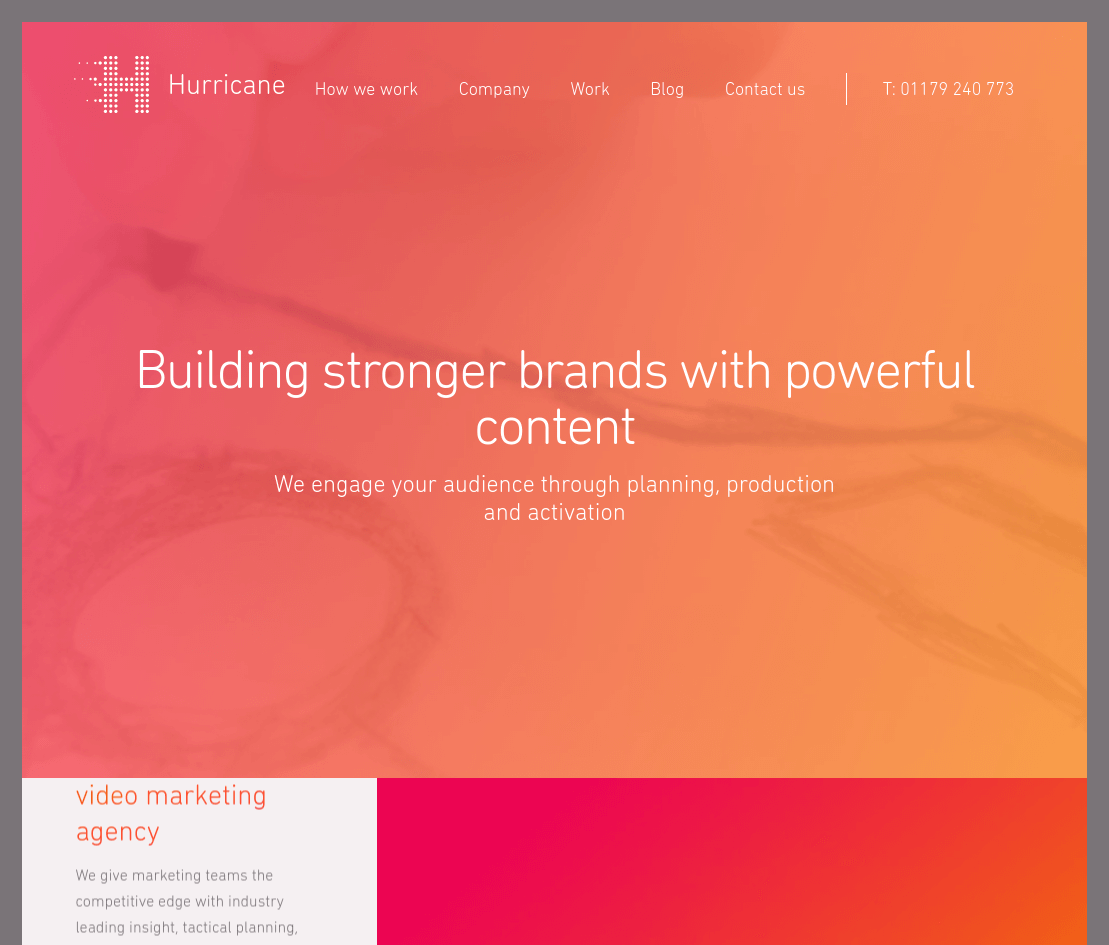
The copy is vague, written in typical “corporate-speak”. The only text above the fold is:
“Building stronger brands with powerful content”
“We engage your audience through planning, production and activation”
Apparently they offer video marketing services, but that took me a few minutes to figure out. Feel free to take design inspiration from this page, but look to some of the other examples here for copy help.
Soap Media
| Clarity of what is being offered: | 25 |
| Offer addresses pain points: | 10 |
| Clear and consistent call to action: | 20 |
| Good contrast in colour scheme: | 15 |
| Balanced and clear layout: | 10 |
| Draws attention to main CTA: | 12 |
Categories: Services, Unique, Long
A single CTA with multiple actions – There are multiple reasons that you would hire a digital marketing agency. That makes it hard to design a landing page for everyone.
This drop-down menu CTA above the fold is one of the best ways I’ve seen to deal with this:
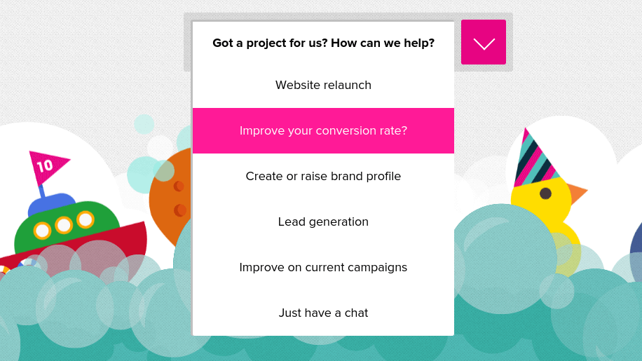
It asks a question as a CTA (“Got a project for us? How can we help?”). Once clicked, 6 options come down which are the most common reasons for visiting the website. They redirect visitors to the appropriate contact form.
It’s a “fun” landing page – There’s a lot of subtle animation going on that makes even scrolling down enjoyable (like the water rising in the background lower down on the page).
Landing pages don’t need to be fun and pretty to be effective, but it’s an added bonus when your business deals with web design.
Newman, Anzalone & Newman
| Clarity of what is being offered: | 30 |
| Offer addresses pain points: | 10 |
| Clear and consistent call to action: | 15 |
| Good contrast in colour scheme: | 15 |
| Balanced and clear layout: | 8 |
| Draws attention to main CTA: | 7 |
Categories: Services, unique
You wouldn’t believe how horrible most landing pages for lawyers are (seriously, what year is it?). But this one gets a lot of things right.
Targeted message front-and-center – The target audience for this landing page are people who want to hire a lawyer for a personal injury. The main message makes it clear that there are personal injury lawyers available for hire.
Additionally, 2 major pain points are addressed, which is a big win. Prospective clients wonder if they have to pay to find out if they have a case, and wonder how much pursuing the case will actually cost.
Offer followed by CTAs – After you see the main message, there’s only one other option immediately available, and that’s to take action. You can chat on the site, call them, email them, or fill out the contact form.
One likely improvement would be to reduce the number of CTAs (you don’t need 3 for live chat), and highlight the most desired one with a different colour. As of now, none of the CTAs stand out.
Wordable
| Clarity of what is being offered: | 30 |
| Offer addresses pain points: | 10 |
| Clear and consistent call to action: | 20 |
| Good contrast in colour scheme: | 15 |
| Balanced and clear layout: | 10 |
| Draws attention to main CTA: | 13 |
Categories: Digital/Software, Minimalistic
Of the hundreds of landing pages I looked at, this is one of the best headlines I’ve seen. It’s clear within seconds exactly what Wordable does, and what’s special about it (“one click”).
I got in touch with one of the guys behind Wordable, Benji Hyam, and he was nice enough to share his recent conversion rates (as of late February 2017):
- “In the past 30 days, it’s converted at 8.48% visitors to trial”
- “In the past 60 days, it’s converted at 7.59% visitors to trial”
Keep in mind that we can’t say if that’s good or bad without more detail about traffic sources and cost. However, I know you might be curious about how some of these landing pages are performing, so it’s nice to mention anyway.
Consistent CTAs that stand out – The page uses a white and grey colour scheme for the background for the most part, so the green CTAs easily catch your attention. The only suggestion I would have is to test making the sticky head CTA turn green as you scroll down.
Thrive Leads
| Clarity of what is being offered: | 25 |
| Offer addresses pain points: | 10 |
| Clear and consistent call to action: | 20 |
| Good contrast in colour scheme: | 12 |
| Balanced and clear layout: | 8 |
| Draws attention to main CTA: | 15 |
Categories: Digital/Software, Minimalistic, Long
Video and text without being cluttered – It’s usually best to have some text before a video in order to draw in the attention of the visitor. If they see the video first, there’s a good chance they won’t even watch it before leaving.
This design allows the video to still appear as a part of the main section that initially draws your attention, but after the main message text.
The benefit is clear – Not only is the product clearly described (“Build your mailing list”), but it claims an enticing benefit (“faster than ever before”). This builds enough curiosity to prompt the visitor to play the video.
Outbrain
| Clarity of what is being offered: | 30 |
| Offer addresses pain points: | 10 |
| Clear and consistent call to action: | 17 |
| Good contrast in colour scheme: | 15 |
| Balanced and clear layout: | 8 |
| Draws attention to main CTA: | 10 |
Categories: Digital/Software, Video, Simple
The video is an extra, not a necessity – Unless it’s absolutely necessary, it can be dangerous to rely on a video to communicate the bulk of your offer. Some visitors just don’t want to watch videos.
Here, Outbrain basically made a landing page without a video in mind, and then added one with a small play button just under the first CTA that shows how their process works.

The benefit of this approach is that if someone already knows how your service works, they don’t get much from watching a video about it. It’s still easy to see that there is a video available if you are interested in that.
Multiple CTAs that stand out – I count 6 CTAs to their registration page on a landing page that isn’t that long. Since the background and overall design is minimalistic, it’s easy to make elements stand out by using just about any colour.
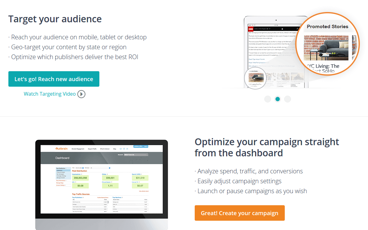
Outbrain uses both orange and a blue-ish colour for their CTAs. They all lead to the same page. Additionally, they use different text for all their CTAs, allowing them to get clicks from visitors who are triggered by different messages.
Hotjar
Categories: Digital/Software, Short, Simple, Video
| Clarity of what is being offered: | 25 |
| Offer addresses pain points: | 10 |
| Clear and consistent call to action: | 20 |
| Good contrast in colour scheme: | 15 |
| Balanced and clear layout: | 10 |
| Draws attention to main CTA: | 15 |
Minimalistic design to highlight CTAs – A common design trend you’ll see if you look at a lot of software landing pages is the dull background (whites, greys), and then a vibrant colour for CTAs (red, orange, green). In this case, Hotjar uses a fairly bright red throughout the page for CTAs and to highlight a few important features.
Unique sticky menu with CTA – Hotjar has a red “try it for free” CTA in the top menu here. As you scroll down the page, it scrolls with you, so that there’s always a CTA on the page.
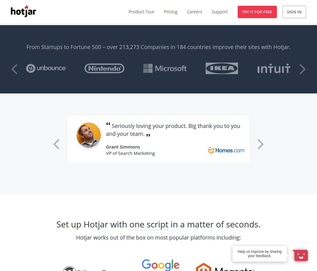
I’m not sure it’s necessary in this case as the page is rather short, but I doubt it hurts much either. It’s something worth trying if you have a long landing page where your CTA will always stand out.
QuickBooks
| Clarity of what is being offered: | 15 |
| Offer addresses pain points: | 10 |
| Clear and consistent call to action: | 20 |
| Good contrast in colour scheme: | 15 |
| Balanced and clear layout: | 8 |
| Draws attention to main CTA: | 10 |
Categories: Digital/Software, Video
Use video if it addresses pain points – Video is commonly used in landing pages for software businesses because their potential customers are often worried about the product being hard to learn and use.
Video allows you to show your exact user experience, which is hopefully a good one.
QuickBooks has a series of videos showing how easy it is to do common tasks with their software, and these videos are the focal point of the page.
Digital Ocean
Categories: Digital/Software, Video, Unique
| Clarity of what is being offered: | 20 |
| Offer addresses pain points: | 10 |
| Clear and consistent call to action: | 15 |
| Good contrast in colour scheme: | 15 |
| Balanced and clear layout: | 10 |
| Draws attention to main CTA: | 10 |
A middle ground between text and video – On the right side above the fold, there is an autoplaying gif (soundless video). Autoplaying video with sound is a big no-no, but no one will complain about a gif.
In this case, it showcases how simple it is to use their service. This is a big win since simplicity is a high priority for most developers.
Consistent colour scheme – Considering the name Digital Ocean, it makes sense that they chose to go with a blue-dominant colour scheme. Sticking with it throughout the page provides consistency to keep the reader immersed on the page.
However, it’s a good idea to break immersion when you want visitors to take action, which is why CTAs usually perform best when they stand out. In this case, I doubt the standard blue CTAs are performing optimally.
Zapier
| Clarity of what is being offered: | 25 |
| Offer addresses pain points: | 8 |
| Clear and consistent call to action: | 20 |
| Good contrast in colour scheme: | 15 |
| Balanced and clear layout: | 10 |
| Draws attention to main CTA: | 15 |
Categories: Digital/Software, Unique, Long
More text isn’t always bad – When it comes to copywriting, less is usually better. However, you shouldn’t sacrifice length for clarity. If you have a complicated product, you can’t explain it in 1 or 2 sentences.
I’d like to point out the main headline and subheading on this landing page. They’re pretty long compared to the average landing page, but Zapier is a complex product that needs some explaining.
I still believe it has some fluff and could be worded more clearly, but the idea behind having a longer title and explanation is fine. Obsess over clarity, not length.
If your product has a workflow, illustrate it – Zapier has 3 main stages to it. A user defines a trigger event to do a certain action, and then the action happens automatically. This isn’t the easiest thing to explain.
However, it’s quite simple once you see the animation on the landing page illustrating this process:

Groove
| Clarity of what is being offered: | 30 |
| Offer addresses pain points: | 10 |
| Clear and consistent call to action: | 20 |
| Good contrast in colour scheme: | 15 |
| Balanced and clear layout: | 10 |
| Draws attention to main CTA: | 13 |
Categories: Digital/Software, Video, Minimal, Long
Green is reserved for the primary CTA – Green stands out the most on this landing page. If you look at the page as a whole, green is only used for CTAs. It’s a good idea to have a single colour that stands out on your colour scheme that is used for your most important CTA (if you have more than one).
What do you know about Groove in the first 5 seconds? – When possible, always try for a headline like this landing page’s:
“Simple Help Desk Software”
After reading those 4 words, every single visitor knows what’s being offered and if it’s even relevant to them.
The subheading reiterates this message. That’s okay, but I believe it could be improved by highlighting a unique part of Groove, to further increase curiosity to watch the video or scroll down and read more.
Moqups
| Clarity of what is being offered: | 25 |
| Offer addresses pain points: | 10 |
| Clear and consistent call to action: | 20 |
| Good contrast in colour scheme: | 15 |
| Balanced and clear layout: | 8 |
| Draws attention to main CTA: | 15 |
Categories: Digital/Software, Long
Hint: Orange stands out on most colours – Depending on how many landing pages you’ve seen here, you may have seen a lot of orange CTAs. It stands out on most of the common background colours (blue, white, grey).
Here, orange is reserved for CTAs only, which ensures that they all stand out. Aim to have your CTAs stand out in a similar way, whether orange or another colour.
Verifiable reviews are the most credible – Look down on the page a bit and you’ll see 9 Tweets from Moqups users:
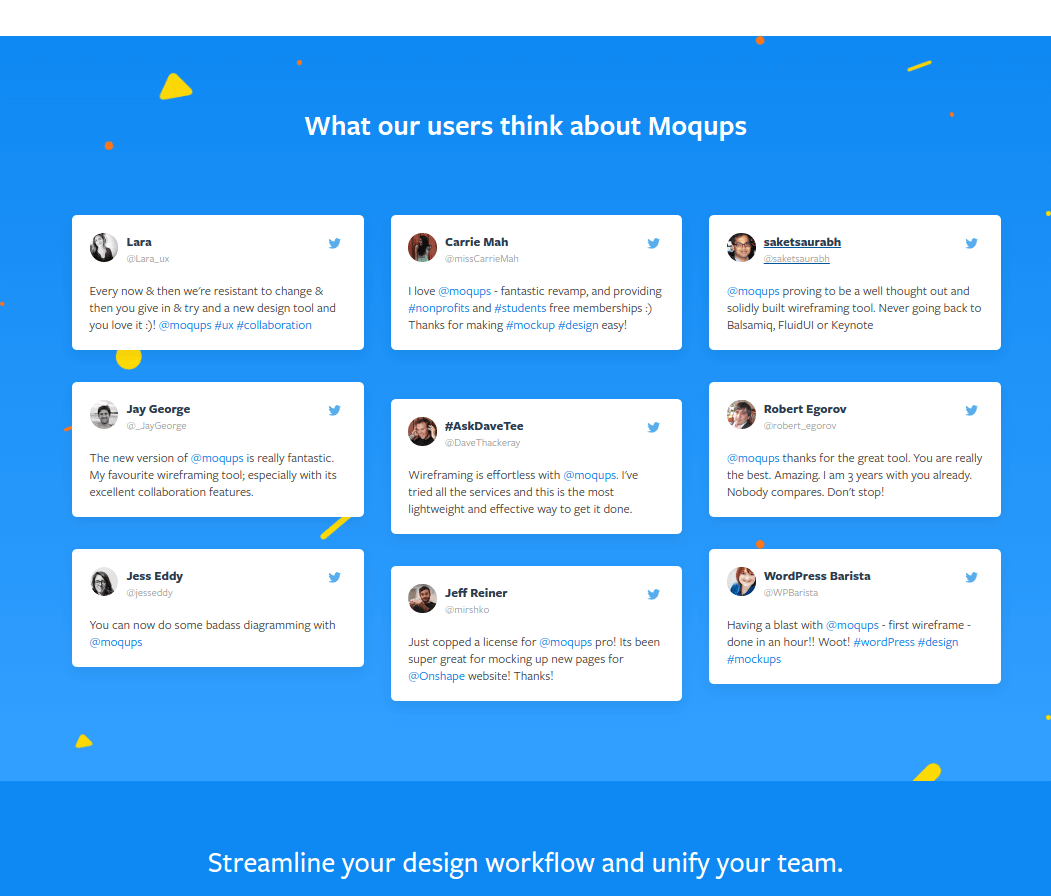
This is a brilliant way to present reviews. If visitors are really skeptical, they can click through to Twitter and find the actual Tweet
Camtasia
| Clarity of what is being offered: | 30 |
| Offer addresses pain points: | 9 |
| Clear and consistent call to action: | 20 |
| Good contrast in colour scheme: | 15 |
| Balanced and clear layout: | 8 |
| Draws attention to main CTA: | 15 |
Categories: Digital/Software, Video, Short
You don’t always want people to buy your product – On the landing page, the orange button (“start a free trial”) stands out much more than the blue button (“Buy Camtasia”).
It is almost always easier to get someone to start a free trial than buy a product. If your product is truly what the potential customer needs, then you don’t need them to pay right away, you just need them to start using your product. You’ll have more customers in the end. Your primary CTA should be the one that benefits your business the most long-term.
Show your product in action – For any product that is actively “used” by a user, showing them how your product actually works is the quickest way to alleviate doubts. Camtasia has a video right away, and 2 large gifs on the relatively small page. These show the user interface and main features of the product clearly.
Codecademy
| Clarity of what is being offered: | 25 |
| Offer addresses pain points: | 8 |
| Clear and consistent call to action: | 15 |
| Good contrast in colour scheme: | 15 |
| Balanced and clear layout: | 10 |
| Draws attention to main CTA: | 15 |
Categories: Digital/Software, Video, Simple
Is your product about features or an experience? – Codecademy is a beginners’ programming site. It’s meant to be the first step in a much longer journey as a developer/programmer/etc.
So instead of focusing on the features of the product, they focus on what Codecademy has helped former users achieve. The only content besides the top sign-up form is a video about a former user, and 3 stories from former users.
If you’re selling to a beginner, chances are they don’t care about the features, they care about doing the things that are interesting to them. The opposite is often true as well. Experts already know all about the results your product should bring, but they care about the technical specifications behind your product to see if they think it can actually deliver your claims.
SeedLegals
| Clarity of what is being offered: | 30 |
| Offer addresses pain points: | 10 |
| Clear and consistent call to action: | 20 |
| Good contrast in colour scheme: | 15 |
| Balanced and clear layout: | 10 |
| Draws attention to main CTA: | 13 |
Categories: Beta, Video
The 5 second test for beta products – It’s clear what the purpose of SeedLegals is within 5 seconds of landing on the page. This is particularly important for beta products where you might not have examples, case studies, and reviews to help you.
Not everything has to be perfect – The other thing of particular note on this landing page is the video created by the founder at the bottom.
It’s not the most “professional” video. It’s the founder talking about why he created the product and what he hopes to accomplish.
But it’s incredibly authentic, and people can connect with a small team that are putting themselves out there. It’s much more believable than some overly-polished explainer video.
FutureDot
| Clarity of what is being offered: | 30 |
| Offer addresses pain points: | 9 |
| Clear and consistent call to action: | 10 |
| Good contrast in colour scheme: | 15 |
| Balanced and clear layout: | 10 |
| Draws attention to main CTA: | 10 |
Categories: Beta, Minimal
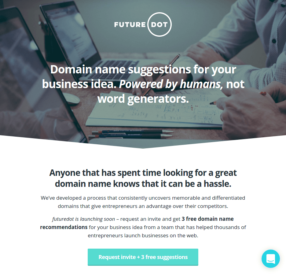
If you have a unique selling proposition (USP), state it upfront – The purpose of a landing page headline is to attract attention and get the reader to go to the next line or scroll down.
Once you’ve explained what your product is (“domain name suggestions” in this case), there’s nothing more interesting than something unique about your product.
What’s special about your offer?
FutureDot name suggestions come from humans rather than bots. If I needed help with a domain name, that would have my interest.
A simple colour scheme makes it easier to highlight CTAs – As you’ll see in a lot of software landing pages, there’s a lot of grey and white in the background.
One big benefit of this is that just about any bright colour stands out on them. In this case, teal.
It’s used effectively for CTAs on this page and to highlight higher cost packages.
Flowcast
| Clarity of what is being offered: | 30 |
| Offer addresses pain points: | 8 |
| Clear and consistent call to action: | 20 |
| Good contrast in colour scheme: | 15 |
| Balanced and clear layout: | 10 |
| Draws attention to main CTA: | 15 |
Categories: Beta, Video
If you need more space, minimise the video size – If your audience is relatively tech-savvy, they understand that a large play button with a circle around it indicates a video.
By using a play button to activate a video overlay, instead of embedding the video player itself, you have a lot more space for text, and even CTAs.
Here, Flowcast gets across a lot of important information above the fold by using this design.
Show, don’t tell – When possible, show your product in action in order to minimise how much you need to write about it.
Scrolling down the page, Flowcast has multiple, large pictures that make it easy to understand the product even if the text beside it wasn’t there.

There isn’t much text, and it could likely be reduced further if they wanted to test it.
MailDB
| Clarity of what is being offered: | 30 |
| Offer addresses pain points: | 8 |
| Clear and consistent call to action: | 15 |
| Good contrast in colour scheme: | 15 |
| Balanced and clear layout: | 10 |
| Draws attention to main CTA: | 15 |
Categories: Beta, Video, Long
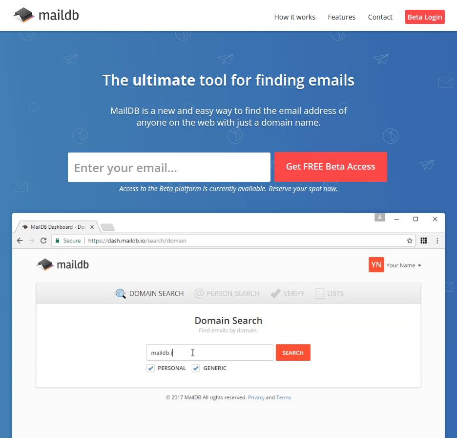
This is not only a good product, but a good landing page as well, especially for a beta page. Its waiting list grew to over 800 (see the comments) when the beta was first released.
If your product is intuitive, you don’t need sound – MailDB is a simple product. You enter in a domain, and it finds you any email addresses associated with it.
You can tell this from the 30 second gif that autoplays above the fold.
People hate autoplaying video, but won’t complain about a gif.
Be accurate with your CTAs – The one big opportunity for improvement I see is the text used in the CTAs.
“Get free Beta Access” implies that when you can get access to the tool right away if you submit your email address.
Instead, it gives you a position on a waiting list. That’s going to annoy a lot of people. When MailDB emails them in a few weeks or longer saying that they can use the tool, many will have forgotten about it.
So while changing the CTA to something more accurate wouldn’t help the initial conversion rate, it would likely end up with a better waiting list to actual user conversion rate.
Candy Bandy
| Clarity of what is being offered: | 30 |
| Offer addresses pain points: | 5 |
| Clear and consistent call to action: | 10 |
| Good contrast in colour scheme: | 15 |
| Balanced and clear layout: | 10 |
| Draws attention to main CTA: | 15 |
Categories: Beta, Short, Minimal
This is a page set up to get validation, since it seems that no working product is actually available.
That being said, it does the 2 most important things that a landing page needs to do fairly well:
- A clear heading/subheading – Within 5 seconds, you know that it’s a service where you exchange local candy with someone across the world from you.
- They collect useful contact information – Not only do they collect an email address, but also a location. This will help them target new customers in the future. Extra form fields can hurt conversion rates, but it’s better for their business in the long run.
Dona
| Clarity of what is being offered: | 30 |
| Offer addresses pain points: | 5 |
| Clear and consistent call to action: | 10 |
| Good contrast in colour scheme: | 15 |
| Balanced and clear layout: | 10 |
| Draws attention to main CTA: | 15 |
Categories: Beta, Short, Video, Minimal
This is a very short landing page, but there are 2 aspects that I’d like to highlight:
- The unique selling point is in the headline – To-do list apps are nothing new. What is new is an AI-powered one. That’s how you grab attention in a headline.
- The gif on the right shows some features that AI helps with – “AI” is a buzzword that not everyone understands. Being able to show some parts of the product (like auto-suggested words) helps visitors understand the offer.
Amazon Nvidia Shield
| Clarity of what is being offered: | 20 |
| Offer addresses pain points: | 8 |
| Clear and consistent call to action: | 0 |
| Good contrast in colour scheme: | 15 |
| Balanced and clear layout: | 7 |
| Draws attention to main CTA: | 5 |
Categories: Physical product, Video
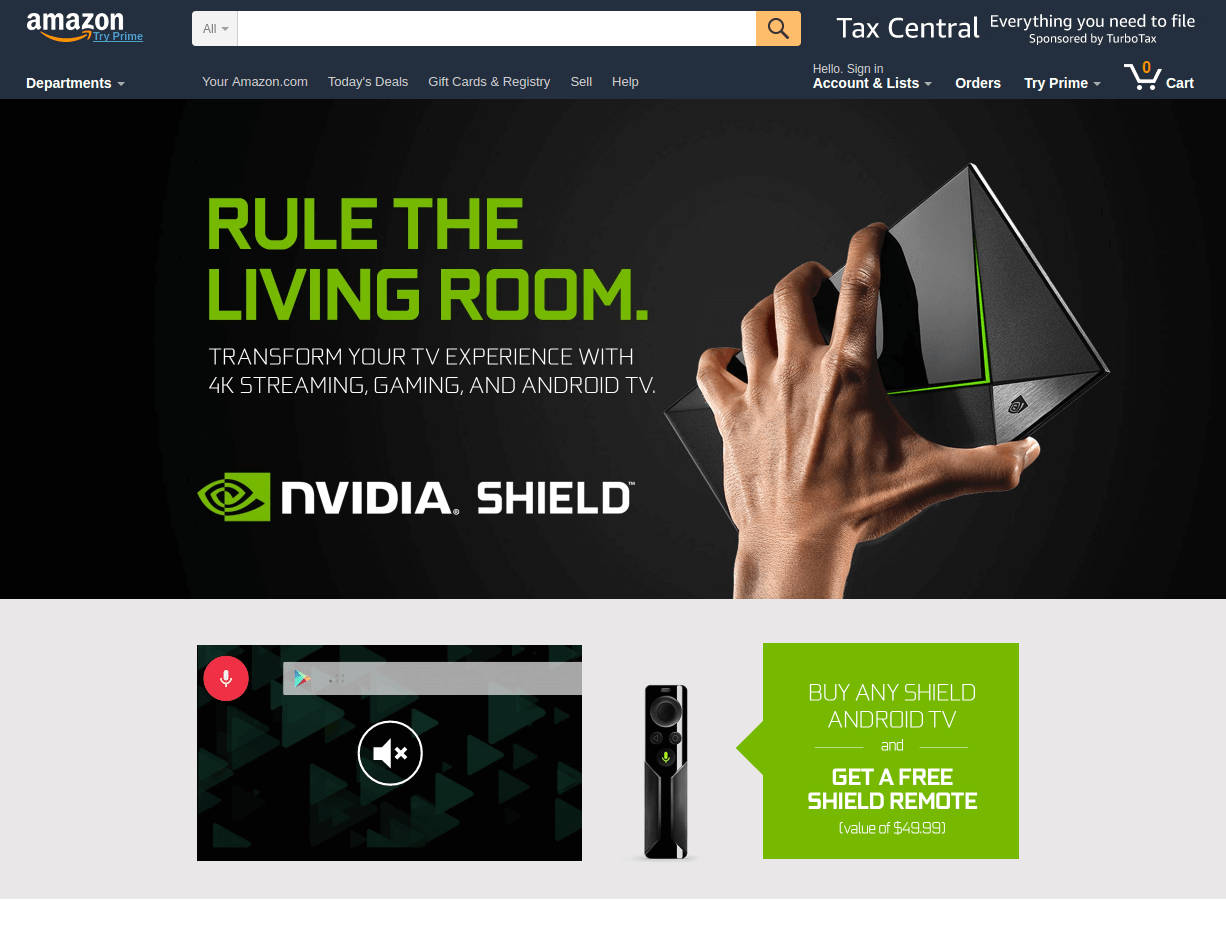
Important lesson: Don’t copy big brands – By all means, get inspiration from their landing pages, but they can get away with things that you cannot.
For example, on this page, the only CTA is a small one in the middle of the page that can easily be scrolled over:

This would hurt you much more than Amazon. If Amazon has one unoptimized landing page, it doesn’t make a dent in their revenue. Plus, most people would continue to search on Amazon anyway for that product.
While you can get inspiration from the design here, consider multiple CTAs, both above the fold and near the end. Make them stand out, like the other example pages here have.
Apple iPhone 7
| Clarity of what is being offered: | 30 |
| Offer addresses pain points: | 10 |
| Clear and consistent call to action: | 15 |
| Good contrast in colour scheme: | 15 |
| Balanced and clear layout: | 10 |
| Draws attention to main CTA: | 12 |
Categories: Physical product, Long, Video
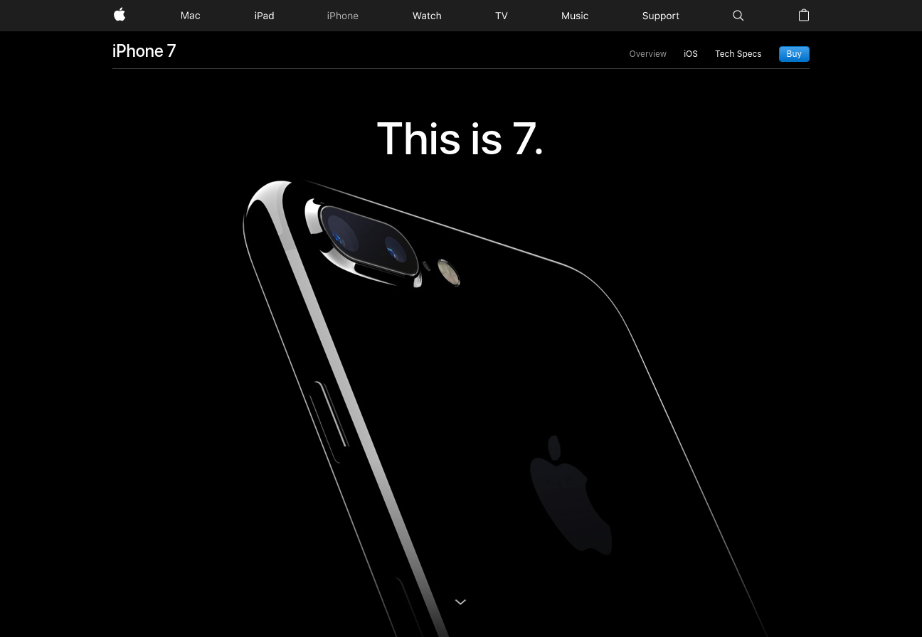
If visitors know your product, start with the CTAs – You don’t land up on this page without knowing what the iPhone 7 is.
Your attention is immediately drawn to the blue “buy” button in the top right. This turns into a sticky menu so that the buy button stays with you as you scroll down.
Focus on the new with an established product – People looking to buy the iPhone don’t care about the old features, because they already know them (more or less).
Every single section on the full landing page focuses on the new features. Those are what excite visitors into buying a new phone:
- The “new home button”
- The “entirely new camera”
- The “brightest, most colourful iPhone display yet”
And so on.
Tesla Model S
| Clarity of what is being offered: | 15 |
| Offer addresses pain points: | 10 |
| Clear and consistent call to action: | 15 |
| Good contrast in colour scheme: | 15 |
| Balanced and clear layout: | 10 |
| Draws attention to main CTA: | 12 |
Categories: Physical product, Video, Unique
Want to make sure a CTA is always visible? – This Tesla landing page has a sticky footer that stays with you as you scroll down.
The page is designed so that the red CTA will always stand out on the black, white, or grey background of each section.
If your product saves customers’ money, show it – I love the simple sliding calculator that is on this page:

It allows a visitor to select a length of trip to see how long it would take to charge the car, but more importantly, how much money they save in gasoline.
I think it could even be taken a step further to show how much they would save on a yearly basis if they made that trip “X” times per year (For example, the amount saved over a year on their commute to work).
Insanity Max
| Clarity of what is being offered: | 30 |
| Offer addresses pain points: | 10 |
| Clear and consistent call to action: | 20 |
| Good contrast in colour scheme: | 15 |
| Balanced and clear layout: | 8 |
| Draws attention to main CTA: | 15 |
Categories: Physical product, Long
Your colour scheme should match your product – Imagine this workout program on a landing page that most software products use. It would look weird.
This workout is supposed to be hardcore, which is captured by the black and red colour scheme. Somehow white, grey, and orange don’t cut it.
Still, they were able to find a colour (bright yellow) for CTAs that clearly stand out.
Results over effort – The fastest way to tank your conversion rates are to emphasise how much work it takes to use your product. There’s a reason IKEA doesn’t highlight the hours it can take to assemble some of their furniture.
This workout is a ton of work. Instead of focusing on that, this landing pages showcases several pictures and videos of people getting great results with the program. If you start with the effort required to use your product, most visitors will just leave.
Fitbit
| Clarity of what is being offered: | 30 |
| Offer addresses pain points: | 6 |
| Clear and consistent call to action: | 15 |
| Good contrast in colour scheme: | 15 |
| Balanced and clear layout: | 8 |
| Draws attention to main CTA: | 7 |
Categories: Physical product, Video
I really like the layout of this page, but there are a few areas that could be improved.
Products that do a lot deserve video – The fitbit is a watch with a ton of features. A short video can explain these better than a long written landing page can.
Fitbit actually made a very good video. But there’s a problem…
You can’t see it, not easily at least.
It’s hidden as the 5th thumbnail on the right panel above the fold. Finding a way to highlight the video would likely improve conversion rates.
Make your order form intuitive – Clever isn’t always good. On this page, the “add to cart” button starts greyed out. You have to pick a size in order for it to become pink.
This is far from obvious.
Most will either think the product is out of stock or not even realise there was an add to cart button in the first place. Considering that there’s only the single CTA on the page, that’s a big problem.
Nest
| Clarity of what is being offered: | 20 |
| Offer addresses pain points: | 10 |
| Clear and consistent call to action: | 15 |
| Good contrast in colour scheme: | 15 |
| Balanced and clear layout: | 10 |
| Draws attention to main CTA: | 15 |
Categories: Physical product
This is a relatively simple landing page with a nice layout, but there’s one thing it does really well…
Benefits before features, and features before specifications – The first rule of copywriting is to emphasise benefits first. In the first section after the hero section, the benefit of “saving energy” is highlighted.
The next section is about features:
- Auto-schedule
- Remote control
- Hot water control
And so on, with short explanations of how these relate to benefits.
Only after all benefits and features have been highlighted does the landing page list the detailed specifications.
Some people do care about them, but most care about the benefits and features much more. In most cases, modeling your landing page after this order will perform best.
EventBrite Conference
| Clarity of what is being offered: | 25 |
| Offer addresses pain points: | 5 |
| Clear and consistent call to action: | 15 |
| Good contrast in colour scheme: | 15 |
| Balanced and clear layout: | 10 |
| Draws attention to main CTA: | 10 |
Categories: Event, Short
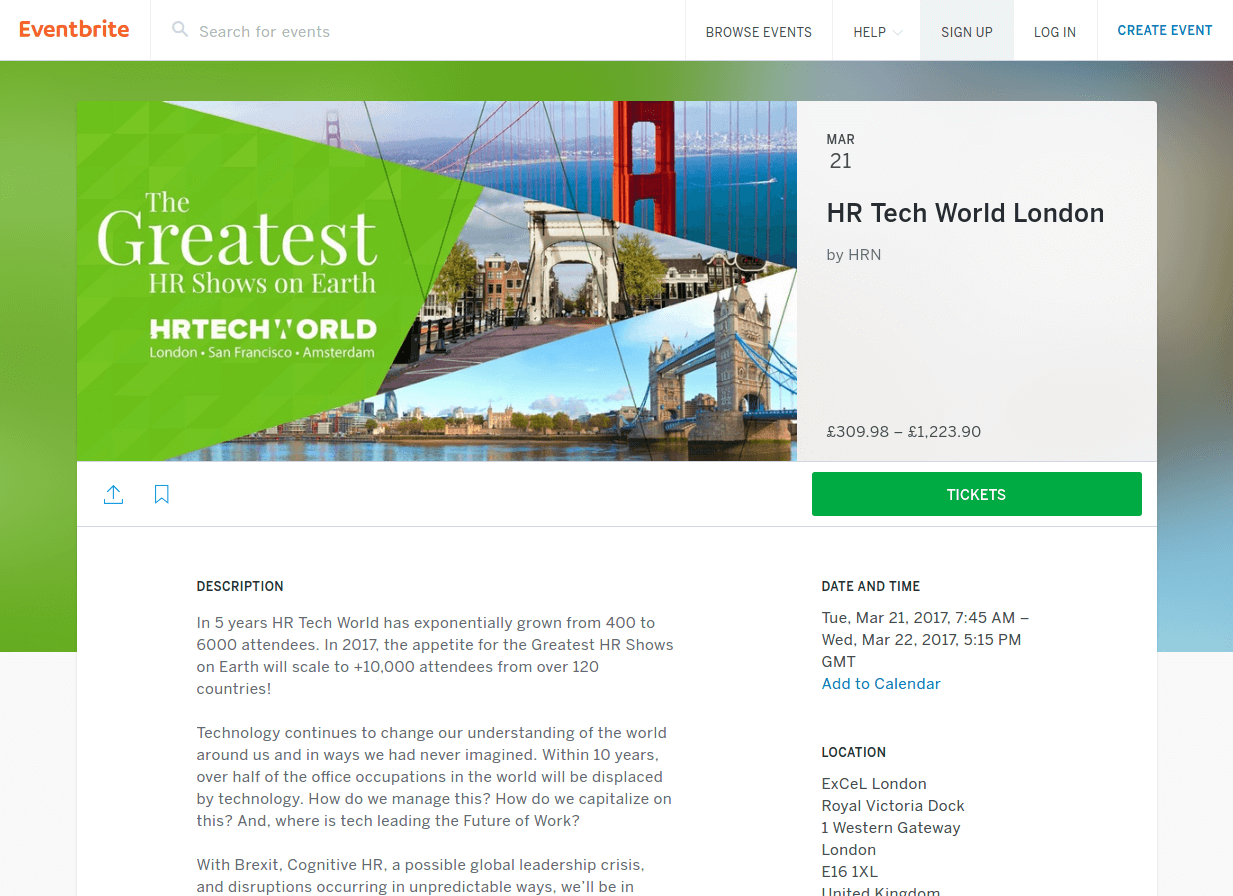
EventBrite is a site where events can be posted and tickets are sold. All of their landing pages look similar to this one.
I think you can get inspiration from the layout, just watch out for a few things from the content side of things:
A floating CTA – The tickets CTA should really be a different colour to stand out from the green background. Aside from that, it’s nicely implemented as it sticks to the top of the page as you scroll down.
Just the essentials – This page is rather plain. It has some detail about the event, as well as the location and date.
However, most event landing pages benefit from videos of past events, or specific examples of speakers/products.
Content Marketing World Conference
| Clarity of what is being offered: | 30 |
| Offer addresses pain points: | 7 |
| Clear and consistent call to action: | 16 |
| Good contrast in colour scheme: | 13 |
| Balanced and clear layout: | 10 |
| Draws attention to main CTA: | 15 |
Categories: Event, Video, Long
There’s some good and bad points about this page.
Headings – The headline is clear, even if it’s not gripping. But the subheading “The largest content event is back” adds nothing to the page.
The essentials are clear – Another positive is that both the date and location of the event are clearly displayed above the fold. Those are the 2 most important initial pieces of information to a potential attendee.
Specific details sell events – Yes, people go to events for the full experience, but their primary reason is to see one or two speakers/products in particular.
They’ve highlighted some of their top confirmed speakers, as well as given details about the number of attendees expected and speakers.
Finally, there’s a good video about halfway down that has footage of past events, which is something that many visitors will look for.
Rugged Maniac
| Clarity of what is being offered: | 15 |
| Offer addresses pain points: | 10 |
| Clear and consistent call to action: | 16 |
| Good contrast in colour scheme: | 10 |
| Balanced and clear layout: | 9 |
| Draws attention to main CTA: | 13 |
Categories: Event, Unique
The good – Date and location are front and center. Even better, there’s a countdown and bar that shows how many spots are left. Those are great ways to establish urgency and increase conversion rates.
The bad – You can’t even see what the event is called unless you look at the very top left of the page.
Worse is that while the CTA buttons are well-placed and formatted, they blend into the red background since they’re the same colour.
You can get inspiration from this page, just make sure to pick a colour for CTAs that stands out.
Unbounce Call to Action Conference
| Clarity of what is being offered: | 30 |
| Offer addresses pain points: | 10 |
| Clear and consistent call to action: | 15 |
| Good contrast in colour scheme: | 15 |
| Balanced and clear layout: | 10 |
| Draws attention to main CTA: | 8 |
Categories: Event, Video
Considering Unbounce is all about landing pages and conversion rates, this landing page better be good!
In all honesty, it’s the best event landing page I found, and there are no obvious mistakes or questionable decisions.
So let me point out some of the good.
Show attendees what the event is like – Conferences can take many forms. Some are worthless, others are amazing experiences. This landing page is littered with past video and photos of speakers and attendees enjoying themselves.
You get a clear sense of what the conference is going to be like, and for most, it’s a positive sense.
Not just any speakers – Displaying any speaker at an event is better than nothing, but in this case, they have some of the most recognisable names in digital marketing.
Multiple CTAs at all times – The top menu is sticky, meaning that the CTA to get tickets is always showing, even when you scroll down.
On top of that, there’s always at least one more CTA either in the content, or on the footer menu that pops up as you scroll down. If a visitor wants to buy a ticket at any time, it’s easy to do so.
DeveloperWeek
| Clarity of what is being offered: | 30 |
| Offer addresses pain points: | 10 |
| Clear and consistent call to action: | 10 |
| Good contrast in colour scheme: | 15 |
| Balanced and clear layout: | 10 |
| Draws attention to main CTA: | 7 |
Categories: Event, Video
Extra, important information through video – You can see all the standard, essential expo information above the fold. Name, date, and location.
Additionally, the background is a video of a past event, which is a good way to show visitors what the event will actually be like. Note that it’s a bit distracting since it’s playing fast, but if it was slowed a bit I think it’d be a great touch.
CTAs don’t always have to follow colour schemes – The black/white/pink colour scheme is nice. Unfortunately, they went way overboard with the pink, so that the register CTAs don’t stand out.
If you find yourself in a similar situation, reduce the amount of pink elsewhere on the page, or pick a different colour that stands out above all else for the CTA.
Unbounce
| Clarity of what is being offered: | 30 |
| Offer addresses pain points: | 10 |
| Clear and consistent call to action: | 20 |
| Good contrast in colour scheme: | 15 |
| Balanced and clear layout: | 7 |
| Draws attention to main CTA: | 15 |
Categories: Lead gen, Short
There’s one lesson from this landing page that stands out for me.
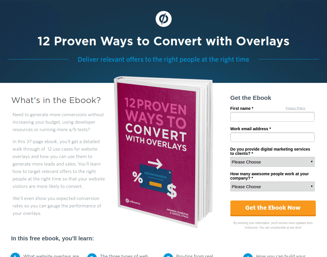
Information without crowding – Considering how short this landing page is, there is a ton of information in it. However, it’s done in a way so that the page isn’t crowded, and it’s still pretty clear where your attention should go (title to book image, to download form, to description).
You can shape the attention path of visitors through colour, shape, and layout. Here, the description on the left is (I’d assume intentionally) set to a light grey in order to make the download form stand out after the book image.
Look at the difference when I make the text black:

Pretend that you just landed on the page.
Now, the description and sign-up form are competing with each other for your attention. It makes the page feel more cluttered to the viewer.
DigitalMarketer
| Clarity of what is being offered: | 30 |
| Offer addresses pain points: | 10 |
| Clear and consistent call to action: | 20 |
| Good contrast in colour scheme: | 12 |
| Balanced and clear layout: | 8 |
| Draws attention to main CTA: | 10 |
Categories: Lead gen, Short
It’s a short squeeze page, but there are 3 things I’d like to highlight:
- Benefits are mentioned near the top – “get more clicks from…”
- Bullet points invoke curiosity (e.g. 18 “threatening” headlines you
can deploy in any market (be careful with these…)” - A clear download form and bright orange CTA that stands out
Neil Patel
| Clarity of what is being offered: | 30 |
| Offer addresses pain points: | 10 |
| Clear and consistent call to action: | 15 |
| Good contrast in colour scheme: | 12 |
| Balanced and clear layout: | 10 |
| Draws attention to main CTA: | 12 |
Categories: Lead gen, Short, Unique
The offer is more important than the medium – This is a landing page for a webinar, and the word “webinar” is mentioned 0 times (at least that’s initially visible).
One thing that Neil understands well is that people aren’t watching a webinar because it’s a webinar, or reading an eBook just to read. They do these things for the promise in the title.
So he starts with a benefit-driven headline:
“How to generate 195,013 visitors a month without spending a dollar…”
If you can credibly claim to have the answer, and tell people to sign-up to get the answer, it doesn’t matter to them if they are signing up for a download, webinar, or whatever else.
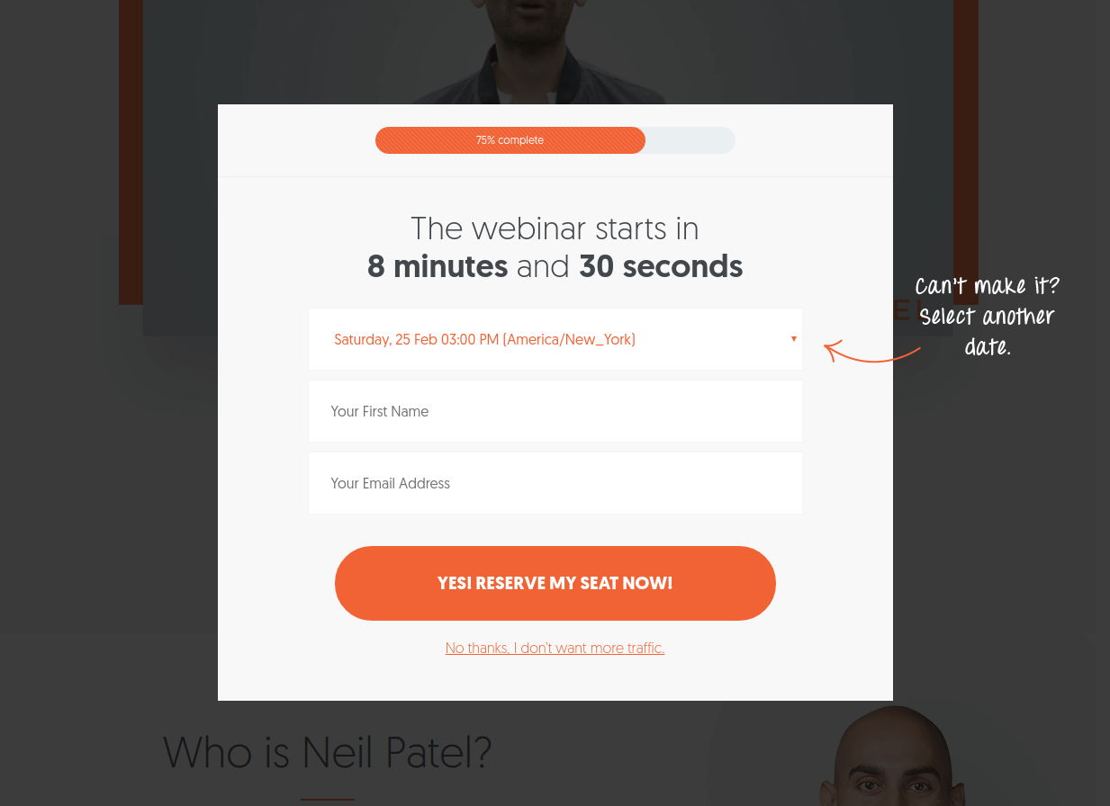
Once they click a CTA, then the pop-up finally specifies that the “online training” is indeed in the form of a webinar:
BuzzSumo Webinars
| Clarity of what is being offered: | 20 |
| Offer addresses pain points: | 5 |
| Clear and consistent call to action: | 20 |
| Good contrast in colour scheme: | 15 |
| Balanced and clear layout: | 10 |
| Draws attention to main CTA: | 15 |
Categories: Lead gen, Short
This is a simple landing page that relies on the visitor already knowing a bit about BuzzSumo. If they don’t, the conversion rate will be abysmal because there’s no real information about the webinar other than that it’s about using BuzzSumo.
The biggest positive about this page is that it’s crystal clear how to register for a webinar. There are multiple dates available to accommodate schedules, and the register CTA is a bright orange on a blue background.
If the only way that visitors will be getting to a webinar landing page of yours is through other parts of your website, a simple landing page like this may be a great choice of inspiration.
KissMetrics Webinar
| Clarity of what is being offered: | 25 |
| Offer addresses pain points: | 10 |
| Clear and consistent call to action: | 20 |
| Good contrast in colour scheme: | 15 |
| Balanced and clear layout: | 8 |
| Draws attention to main CTA: | 13 |
Categories: Lead gen, Short
KissMetrics has been conducting regular webinars for years, very successfully. Their landing page for upcoming webinars has been the same for as long as I can remember.
Pay the most attention to:
- The benefit-driven title – “Leverage existing customers for growth”
- Benefit-driven bolded bullet points (e.g. “increase referrals)
- The clearly visible registration form – black on white always
stands out - Pictures of the teachers – Sujan is well-known and respected in the
inbound marketing world.
Microsoft Small Business Academy
| Clarity of what is being offered: | 20 |
| Offer addresses pain points: | 5 |
| Clear and consistent call to action: | 20 |
| Good contrast in colour scheme: | 15 |
| Balanced and clear layout: | 9 |
| Draws attention to main CTA: | 15 |
Categories: Lead gen, Short
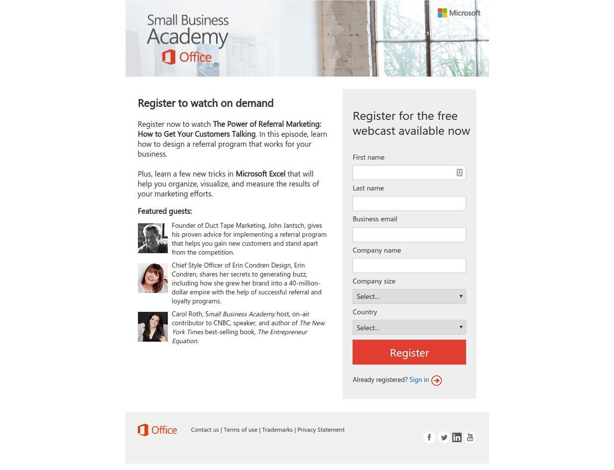
Recognisable authors and teachers give credibility – Whether you have an eBook or webinar, showing that you have someone credible behind it will help conversion rates.
In this case, all 3 webinar leaders either run large sites or is a best-selling author.
Straight to the registration form – The registration form is large and stands out against the white background.
When your offer is a webinar or eBook, there isn’t much more needed than a headline and brief description. If those are good, you’ll get sign-ups.
Wrapping things up
Hopefully this was a painless way to find landing page examples that were actually useful for you.
If you felt like you could have used more examples of a specific type of landing page, leave a comment below with the specific filters you’re interested in.
We’ll continue to update this page with the best landing page examples we come across.
















About The Author: Ed Leake
More posts by Ed Leake