You have a landing page, or are building one, and don’t want to miss anything important.
Well, I happen to have a list of landing page best practices here.
Put the two together, and you should end up with a solid landing page that converts.
If you look for best practices elsewhere, you’ll likely find a slew of opinions, which is fine.
But we took a different approach here.
These best practices are based on real patterns from 89 landing pages that we’ve studied.
The 89 landing pages were drawn mainly from 2 sources:
- The Complete Collection of Landing Page Examples
- Pages that were advertising on Adwords for high competition (expensive) keywords
While we don’t have conversion data from them, we feel it’s reasonable to expect that the pages convert relatively well.
Clearly this isn’t perfect data, but it’s strong enough to notice the big patterns that should guide the best practices of creating a landing page.
At any time, you can check out a copy of the raw data we recorded, and validate my work, or do some extra investigating of your own.
I’ve divided up the results into several questions to present our findings.
1. How long should landing page headlines be?
Your headline is typically the biggest element above the fold on your page and gets immediate attention.
A good headline can have a dramatic effect on conversion rate.
With our analysis, the first thing we did was gather the landing page headlines from our sample and see how many words they were:

The average headline was 6.52 words.
The majority of headlines ranged from 3 to 8 words, although there’s a signficant amount that are longer.
The takeaway from this is that headlines don’t necessarily have to be short, but that you should be able to find a good one that is around 7 words long.
If you go above 14 words though, you should probably try to cut it down.
2. What words and styles are best in headlines?
One hypothesis I had coming into this was that certain words and features would be common in headlines.
Turns out I was wrong.
One trend that you might notice in landing pages is that some headlines are all capital letters. Overall, only 11 out of the 89 pages had headlines in all capitals.
If having all capital letters really improved conversion, more pages would have it. Likewise, if it harmed conversion, none, or very few, would use them. I’d say it having an all capitalized headline just doesn’t matter.
The second thing I analysed were the specific words used.
Here are the top results when I generated a list by frequency:
| Word | Count |
|---|---|
| the | 23 |
| for | 13 |
| to | 12 |
| your | 12 |
| a | 10 |
| in | 9 |
| and | 6 |
| conference | 6 |
| free | 6 |
| with | 6 |
| marketing | 5 |
| of | 5 |
All of them with the exception of conference, free, and marketing are stop words. Even those 3 aren’t that common (6/89 is only 6.7%). My takeaway is that there aren’t any particular words that you should focus on including in your headline.
We already know that writing headlines is complex, but unfortunately weren’t able to make it simpler from this part of the analysis.
3. What are the best features to include to increase conversion?
There are many different aspects to a landing page.
It’d be very difficult to record them all.
Instead, I looked at several pages and tried to pick out the most common features that were given prominent space. Eventually I picked 4 that stood out.
For each landing page, I recorded if the following features were present:
- Trust signals – Things like “as seen in”, TrustPilot logos, and other 3rd party marks of credibility.
- Testimonials/reviews – Although you could consider these a specific trust signal, I included them as a distinct, independent feature.
- Features list – If a page listed features explaining the offer in more detail, I included this.
- FAQ – Multiple common questions and answers provided on the page.
This is a table of the raw counts of pages that had each feature:
| Feature | Pages that had it |
| Features/How it works | 72 |
| Trust signals | 49 |
| Testimonials/Reviews | 41 |
| FAQ | 9 |
There’s nothing too mind-blowing, but a few insights worth keeping in mind:
- 81% of pages listed features of their offer in some way.
- 32 pages had both trust signals and testimonials.
- Only 10% of pages included a FAQ of any kind.
In terms of best practices, most landing pages should include at least some detail about the features of the offer or how the product works.
Additionally, FAQs aren’t needed for the majority of landing pages.
Finally, trust signals and testimonials fall somewhere in the middle. Many pages like including them, and many are fine omitting them. There’s no best practice from that, you’ll need to test them for your individual page.
4. What words should you use in your Call to actions (CTAs)?
Unlike headlines, CTAs are much shorter and general.
In our recent post about creating high converting call to action buttons, we looked at the call to action button text for all these same landing pages.
You can see the complete word list here if you’d like, in the “word list” tab.
After removing stop words, the most common action words (and frequency) were:
| get | 21 |
| free | 19 |
| register | 9 |
| buy | 7 |
| book | 6 |
| download | 6 |
| try | 5 |
And the most common final words were:
| now | 22 |
| access | 6 |
| tickets | 6 |
| quote | 5 |
Typically, you’ll want to pick one of the first words (action words), insert a word about your offer, and then finish with one of the words in the second table.
For example, “get tickets now.”
Refer to the full post about call to action buttons if you’d like more detail.
5. Should your form fields be visible on the landing page?
Hiding your forms might be prettier, but should it be considered a best practice?
To find that out, I recorded if each page had visible input fields followed by the CTA.
That includes anything from a complete form to a single email address field.
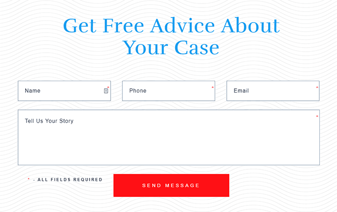
I found that 35 landing pages had visible form fields, which is about 39%. The rest either redirected clickers to another page with forms on them, or put the fields in a pop-up (that activated upon button click).
Again, when an element is in that middle range, it likely doesn’t have a large effect on conversion rate.
If it was bad, fewer pages would have visible fields. If it was good, more would have visible fields.
Since it is relatively split, it seems like a design preference.
6. What’s the most popular background colour above the fold?
This was one of the toughest elements to examine because there’s often many colours used on a single page, and many shades.
However, remember that we’re looking for general patterns that we know work. So by focusing on the most prominent features, I think we can still draw some best practices for it.
When I say background color here, I’m talking about the main color used above the fold, usually in the center of the page behind the headline and offer.
Here’s a count of each colour I observed:

Keep in mind what these results say.
It’s not saying that you have to use them, or that they are the best, but that they work.
For colours like grey, blue, white, and black, they have a high enough count that we can observe that they work in many different situations.
As far as a best practice goes, stick to grey, blue, white, or black as your main background colour above the fold. They’re safe options.
Once you go to other colours, it gets harder to find colour schemes that work together.
7. Should you have a picture or plain background above the fold?
On top of the main colour used in the background above the fold, there’s often media included as well.
The best way I could handle this was to divide media types into 4 categories:
- Product – A sizeable picture or video of the product (or something representing the product).
- Picture – A large picture in the background, usually spanning the entire width. Here’s an example.
- Video – This is a video (or gif) in the background, usually spanning the entire width.
- Plain – A solid coloured background (or a picture with minimal features).
Here’s the breakdown of the results:
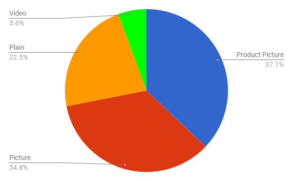
First off, very few pages (just 5) used a video/gif playing in the background. In fact, all of these were landing pages for events. For example, Web Summit.
The other 3 types were fairly evenly distributed, which means that there isn’t a best practice takeaway here unfortunately.
Clearly, plain and picture backgrounds, as well as product pictures can all be used on a variety of good landing pages.
That means you’ll have to test this aspect with your specific landing page.
8. What colour menu is most popular? (Should you have a menu at all?)
Right away, 20 pages had no main menu.
It’s a tactic that has been discussed a lot. With no navigation links, there’s theoretically less chance that a visitor will bounce.
But still, the majority of pages included a menu.
Here were the results of looking at the menu colours used:

White menus were most popular, followed by black, grey, and blue.
This alone doesn’t tell us too much, so head on to the next question where we look at complete colour and type combinations.
9. What are the most popular colour and type combinations above the fold?
To make the results actually useful, I plotted the counts of each combination of:
Background colour – background type – menu colour
You can see the bar chart below:

The most common combinations, and best practices for a simple landing page were:
- Grey background, plain, and white menu (6)
- Blue background, picture in background, and white menu (5)
- Grey background, picture in background, and no menu (4)
As expected, grey and blue backgrounds are most frequent, but now we can pair them with media and menus.
10. What colour should your CTAs be?
Again, we did an extensive analysis of creating great CTA buttons.
After recording the colour of each button, these were our results:

Four CTA colours stood above the rest:
- Orange
- Blue
- Red
- Green
These all stand out on white and grey backgrounds. Orange, red, and green also stand out on blue backgrounds.
While other colours can work, these are simple, proven CTA colours that should perform well in general.
11. How long is a good landing page?
Next, I set off to study the length of each landing page.
This had to be done in height (pixels), which of course depends on screen size. For reference, I did all this data collection on a standard 1920x1080px screen.
First, let’s look at the overall height distribution:
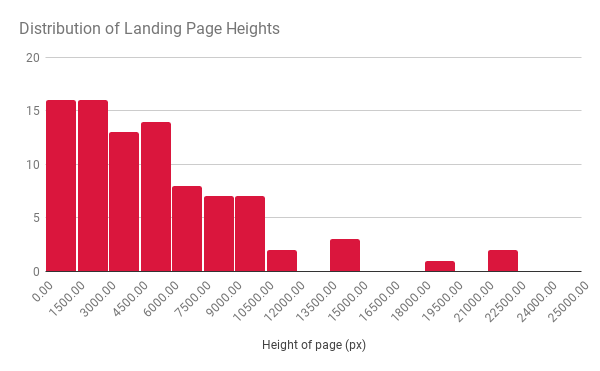
Those bars represent buckets (1500px ranges).
There is quite a wide range, although most pages were under 6,000px.
There certainly isn’t a specific height that was by far the most popular.
With no luck there, let’s look at the average page height of each category of landing page:

Landing pages for digital products (mainly Ebooks) are much shorter than any other category.
Intuitively, this makes sense. You don’t usually need to sell a cheap (or free) product as much as a more expensive one.
The only real best practices we can glean from these results are:
- If you have a cheap or free product, start with a shorter landing page.
- For any other product, if you have enough detail, you’ll be closer to 5,000-8,000px high on a 1080px wide screen.
12. How many CTAs should be on your landing page?
Measuring the height of each page also lets us examine one more thing: how many CTAs you should have per page, given that height.
After excluding 17 pages that were too short (no scrolling), which all had just 1 or 2 CTAs, I divided the height of each page by the number of CTAs to obtain this chart:

What it tells us is that you should, on average, have at least one CTA for every 1,000-2,000px in height on a standard desktop. In other words, a CTA should always be at most 1 full screen scroll away in most cases.
I didn’t include all the pages in the above graph. That’s because there’s one more distinct situation…
A growing trend I observed is the inclusion of sticky CTAs.
As you scroll down the page, a CTA follows you down at the top or bottom of the page. They ensure that there is always a CTA on the screen at all times, on all screen sizes. For example:
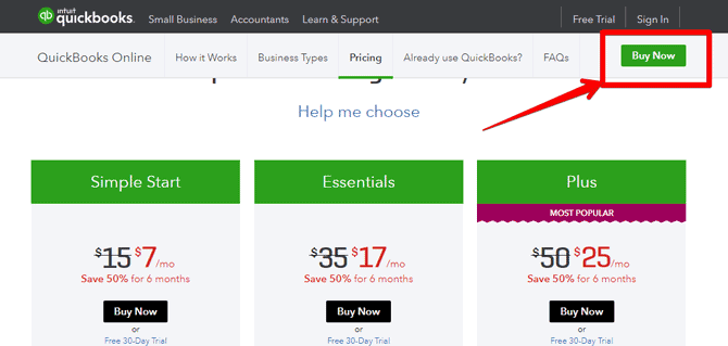
27 of the pages, or 37.5% had sticky CTAs.
While that’s not enough to call it a best practice, it’s an interesting idea that is probably worth testing at some point.
13. How important is a mobile-friendly landing page?
Mobile friendly design has been a hot topic for a few years now.
This was a simple yes or no test to see if pages were at the very least responsive and generally useable on mobile.
I ran all the pages through Google’s mobile friendly testing tool.
If the site had blocked Google, which happened in a few cases, I examined the page manually to see if it was mobile friendly.
A whopping 88 out of 89 pages were mobile friendly.
That’s not even a best practice at this point, it’s a requirement.
14. How important is your landing page loading speed?
Just like mobile friendliness, loading speed is also one of the most talked about topics.
Turns out that many don’t practice what they preach.
I ran all the pages through Pingdom (using the Dallas server location), and recorded the times. While ideally you’d perform this test at multiple times during the day (and multiple days), this will still give us a good picture of loading time.
Overall, the average loading speed was 3.18 seconds, which honestly isn’t too great. Google has hinted that anything over 2 is “slow.”
Here’s the full distribution:
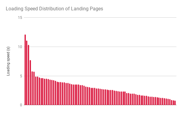
Other than a few outliers (maybe I hit them at a bad time), almost all page load times were under 5 seconds.
As a best practice, make your landing page load as fast as possible, but aim for under 5 seconds at the very least.
A summary of landing page best practices
While there’s a lot of ifs and maybes when it comes to experiments like these, here is my best attempt at picking out the best practices for a landing page:
- Most headlines should be 3 to 8 words long.
- Most landing pages should list features and expand on them.
- Use one of the following combinations above the fold:
- Grey background, plain, and white menu
- Blue background, picture in background, and white menu
- Grey background, picture in background, and no menu
- Use an orange, blue, red, or green CTA button
- If you’re offering a digital product, keep your landing page short (around 2,000px for a desktop user)
- Have at least one CTA for every 1,000-2,000px in height on a standard desktop
- Your page must be mobile friendly.
- Aim for a loading time below 3.18 seconds to be above average.
If you do all that, you give yourself a good foundation to succeed on.


About The Author: Dale Cudmore
More posts by Dale Cudmore